
Market Commentary
Wesley Chapel, FL
There was a time when nobody cared about monthly Consumer Price Index (CPI) data. In fact, that time covered the vast majority of my career in the financial services industry. I look forward to the day that people go back to not caring. For now, CPI data is promoted as the “big data release” of the week by basically every financial outlet on the planet, and those promotions continue to generate clicks. Since we are stuck with it, let’s look at what’s important rather than what grabs the public’s attention.
News flash: Inflation is still high.

(It’s not fake news!)
There, now you know what the data will say when it comes out tomorrow morning before the market opens. Just because everyone in the market already knows this doesn’t mean there won’t still be a short-term volatile reaction (up or down) when it is released. The short-term reaction is likely to just be “noise” though.
The economic realities we are facing (more on this later) are longer-term in nature. High inflation has been with us for years now, despite those geniuses over at the Federal Reserve Bank (FED) telling us that inflation was only transitory all the way back in 2021.
Why they (at the FED) have any credibility left or why anyone thinks they can engineer a “soft landing” is beyond me. They have no clue what they are doing. In fact, Jerome Powell, in his recent speech from Jackson Hole, Wyoming, went so far as to say:
“We are navigating by the stars under cloudy skies.”
No joke – he actually said that with a straight face! I couldn’t make it up if I tried.
The annual percent change in the CPI (which is how the Bureau of Labor Statistics (BLS) tracks inflation) is expected to come in at 3.6% for the month of August when it is reported tomorrow morning. This is up from the 3.2% annual increase that was reported for July.
Check out the most recent Elevate Market Chat!
Markets have been selling off giving the bears new fuel. Is this the top or will the trend higher resume? Join Shane and Kyle as we discuss the underlying fundamentals and levels we are watching.
July was the first acceleration (up from 3.0% in June ‘23) in price increases since June of 2022. Since then, prices have been increasing but at a slowing rate. Those of you who read my July commentary might remember that I expected this reacceleration to happen. That wasn’t a lucky guess, and it certainly doesn’t mean that I have a special ability to predict the future… it should really come as no surprise to anyone who looks at the data. Why?
It’s all about the “comps,” aka the comparisons. Sometimes referred to as base effects.
Its a relatively complicated idea to express in words but I am going to give it a shot. I’ve commented on this before but I don’t think I did a great job. Understanding comps is important and is something I would want you to help me understand if our roles were reversed. So here we go.
Imagine that you bought a property for $500,000. You want to understand how its value has increased as a percentage growth rate over the years. And for the sake of simplicity lets just assume that the value of the property increased by $100,000 per year. At the end of the first year the value was $600,000. And a $100,000 gain starting from $500,000 is 20% growth. ($100/$500 = 0.2).
At the end of the second year, the value of the property increased by the same $100,000 to $700,000. But since we are starting from a higher “base” of $600,000, the growth rate has decreased to 16.67%. ($100/$600 = 0.1667).
You see, we are comparing (or “comping”) the $700,000 with a higher (harder or more difficult) $600,000 as opposed to the starting value of $500,000.
The property was up by the same $100,000 but as a percentage the “rate of change” actually slowed.
Now imagine if you had an abnormal year and the property instead of growing by only the expected $100,000 in year three, the property actually increased in value by $300,000 to finish at $1 million before resuming its normal $100,000/yr increase:
$1,000,000 compared to $700,000 is an increase of $300,000. Using a “base” of $700,000 the $300,000 gain represents an increase of 42.85%. ($300/$700 = 0.4285).
In the next year, if the property increases by the usual $100,000 to $1.1 million, a much harder “comp” than the original $500,000, the growth rate declines from 42.85% to only 10%. ($100/$1,000 = 0.10%).
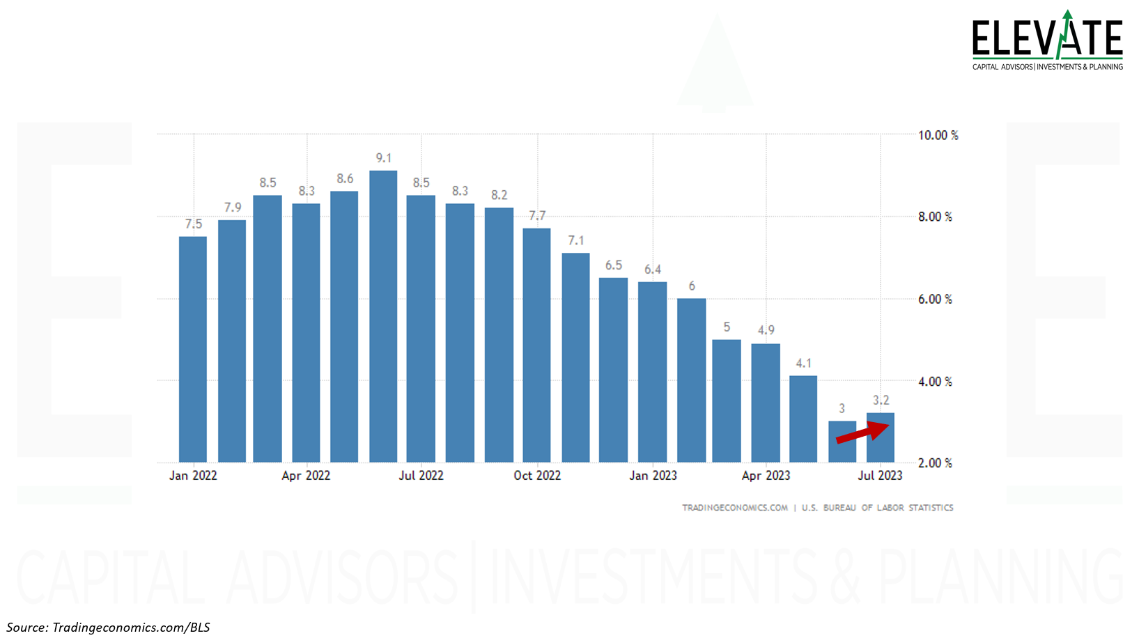
Annual Percent Change in CPI
Click Image to Enlarge
This is basically what has been happening with CPI.
Back in June of 2022 inflation was reported at 9.1%. That was the peak annual rate of change or increase (so far) for this cycle. See the nearby chart of the Annual Percent Change in CPI. above. One year later in June 2023 the percent change of inflation was compared to that peak number. When compared to such a high inflation rate in the prior year it is relatively easy to report a somewhat lower (but still high overall) rate. Ever since then the comparisons (or “comps”) have gotten and will continue to get harder until June of 2024 (which will be reported in July of 2024). And that is mostly why, but not the only reason, that the annual percent change in inflation has once again begun to tick higher.
Visually, you can also sort of see how this works in the chart below of oil prices. Forgetting the numbers for a second, let’s focus on the big picture. Notice that the “August to August” change is virtually flat when compared to the “June to June” change. June was the easy comp. It was the peak. Since then, we have been comparing each month-end to a lower and lower prior year level and it becomes more difficult to show such a large drop.
Crude Oil Price:Notice how the “June to June” change was relatively large. The “July to July” change was relatively smaller. The “August to August” change was relatively flat. This is not only due to the recent rise in the price of oil but largely impacted by the “base effects” or what are often referred to as “comps.” Each month we are comparing to a lower and lower price from 12 months prior, in this case flattening out the decline in price.
Click Image to Enlarge
Don’t forget that crude oil is not only a large component of CPI, but it also drives price inflation higher for other goods and services because pretty much every business has to pay for energy to deliver their product or service.
On top of the comps getting more difficult (assuming a lower price of oil is preferred), we are also seeing the price of crude oil rise rapidly (again) over the past few months. The price of oil is up over 30% (from $67/bbl to $87/bbl) since the middle of June.
Based on this (and other similar data in other markets) nobody should be surprised if CPI comes in as expected and shows the second consecutive month of (re)acceleration. And if it does, then nobody should be surprised if the FED decides to hike the overnight lending rate by yet another 0.25% when they finish their upcoming meeting on September 20th.
Pretty much the only thing that Jerome Powell has ever said that I think you can believe is that they (the FED) won’t stop hiking rates, let alone cutting them, until inflation has gotten back down to their (the FED’s) 2% target. Don’t ask me why 2% is the target either. It is totally arbitrary.
And even though it might not feel like it after having seen inflation as high as 9.1% recently, 3.6% is A LOT higher than 2%.
As easy as Powell makes it for us not to believe him, or make fun of him… I do believe that he understands and is terrified of what happened with inflation back in the 1970’s when the FED (under then-chairman Arthur Burns upon whom history doesn’t look back too kindly) essentially declared victory a bit too early and eased policy allowing inflation to regain momentum. Some of you probably remember the “stagflation” of the 1970’s leading up to the insanely high interest rates of the early 1980’s.
Former Secretary of the Treasury, Lawrence Summers, recently posted on twitter the below image showing how inflation progressed back then as an analog to how inflation has progressed more recently. Love him or hate him, the data is the data. And the data is a little scary!
Click image to enlarge
I know, I know… this time is different. Time will tell if the outcome is any different because one thing that hasn’t changed for basically all of human history is emotional behavior. And that is why we say that even though history doesn’t repeat exactly, it often rhymes.
Lest anyone think that I am not paying attention, the BLS also reports a “core” inflation number which excludes energy and food prices. That annual rate of change is expected to be reported as 4.3%, down from 4.7% last month. But even though the core CPI is still showing “disinflation,” it is also substantially higher than the FED’s 2% target and won’t stop them from hiking by another 0.25%.
The other goal of the FED is to maintain maximum employment. When reported last week, the unemployment rate ticked slightly higher from 3.5% to 3.8%. The number of job openings also declined more than expected to their lowest level since March 2021. The market took this to mean that the FED would not hike rates later this month. Maybe the market thought, even if just momentarily, that the FED could cut rates as a result. But this, again, was short term “noise.”
Click image to enlarge Unemployment Rate
An unemployment rate of 3.8% is still way below historical averages and near all-time lows. This basically gives the FED permission to continue hiking rates if they believe inflation is accelerating, as the recent data would support.
Further, there are still about 1.5 jobs available for each person looking for a job. That means the labor market is still “tight” and employers have to pay more to attract an employee – thus driving price inflation in the goods and services offered by that employer.
Nothing in this data leads me to believe that the FED will cut rates any time soon. If anything, I am more confident that they would hike rates further, putting additional downward pressure on prices and stocks.
As time goes on, higher interest rates threaten to create a chain reaction in the economy. Consumers get pinched by rising rates on their credit card balances and variable rate mortgages. They’re forced to reduce other spending, which cuts into the revenues of businesses that are contending with higher rates on their bank loans. Those businesses consequently defer expansion plans, resulting in revenue declines at business-to-business companies (as opposed to those that directly serve consumers).
The market has largely shrugged off these economic realities so far in 2023 (which has been surprising to me personally). But I have little doubt that reality will eventually catch up with the market. Perhaps it has already begun to happen as August was the first down month for the stock market since February.
The benchmark S&P 500 index was down as much as 5.41% on August 18th (in August alone) before recovering to finish down only 1.63% for the month. As of this writing, the index is down another 1% in September.
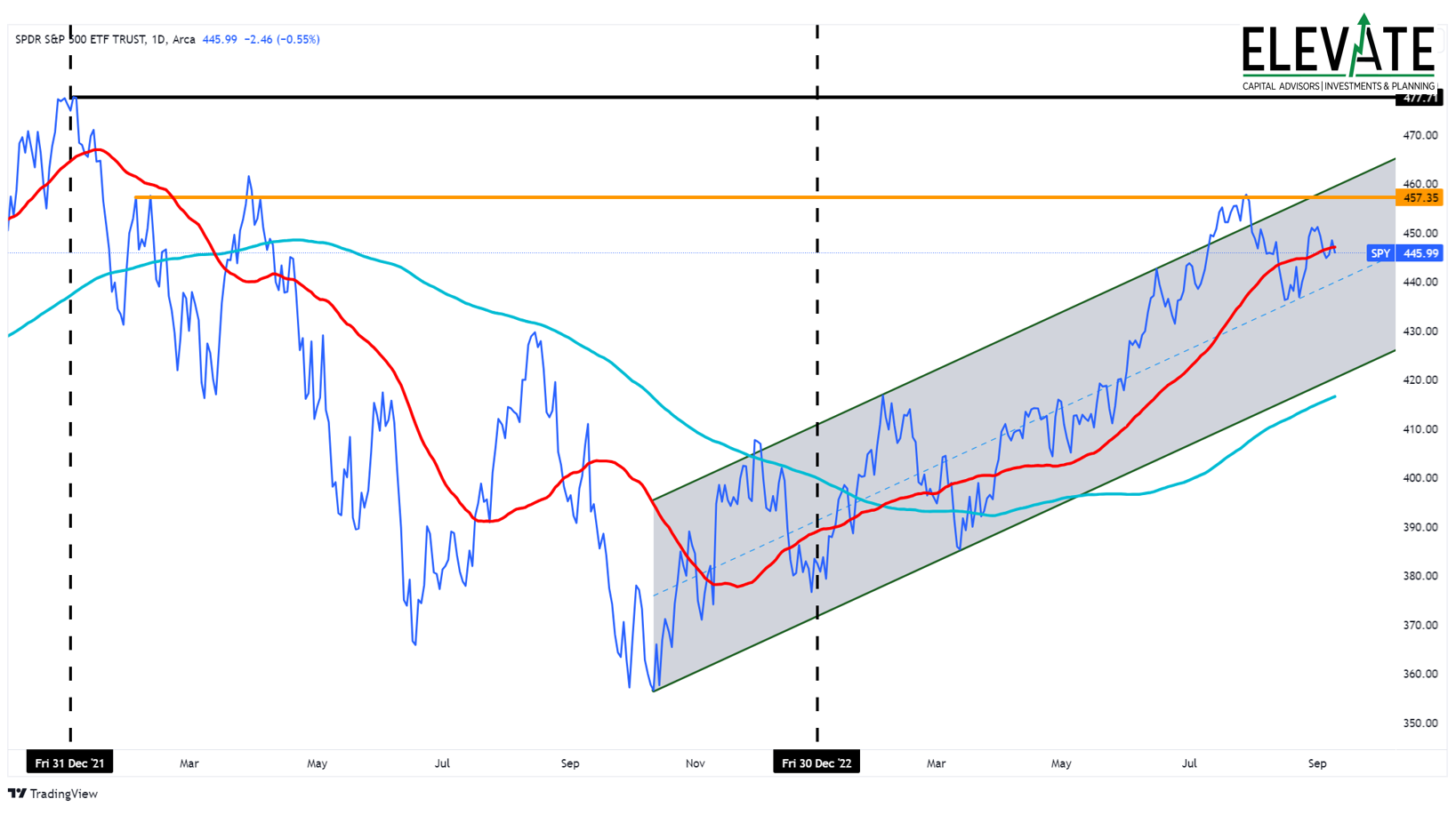
Click Image to Enlarge
S&P 500 Index (SPY)
The index is in an uptrend, trading above its long-term 200-day moving average (light blue line) but just below its intermediate-term 50-day moving average (red line) after having run into some resistance since late July and has mostly moved sideways since then.
In the interest of telling you what I would want to know if our roles were reversed, I just want to reiterate that the “benchmark” indexes are broken, which I have mentioned in prior commentaries.
Click image to enlarge
Nvidia is carrying the entire US economy!
Imagine if you had a tape measure that skipped an inch every few feet. You’d use it to measure the cut you need to make, or where you need to put a hole, and when it came time to use the cut or the hole it would be in the totally wrong place. It would cause you to make decisions that were ultimately bad through no fault of your own.
I am actually re-reading the classic book, “Fooled by Randomness” by Nassim Nicholas Taleb and this morning I came to a section called “Wittgenstein’s Ruler.” Taleb says:
“Unless you have confidence in the ruler’s reliability, if you use a ruler to measure a table you may also be using the table to measure the ruler. The less you trust the ruler’s reliability the more information you are getting about the ruler and the less about the table. The point extends way beyond information and probability. This conditionality of information is central in epistemology, probability, even studies of consciousness.”
Click image to enlarge
Well, today our benchmark indexes are highly concentrated in just a few stocks that the media has taken to calling the “Magnificent Seven.” Again, you can’t make it up.
Currently, 27.67% of the S&P 500 is invested in, and therefore driven by, the returns of these seven stocks. These seven stocks are collectively up 96.25% in 2023. The result is that these stocks are responsible for the S&P 500 index being up approximately 26.63% in 2023, because 27.67% x 96.25% = 26.63%.
But the index isn’t up 26.63% this year. It is only up 17.21%... As regular readers know, I don’t care for YTD returns, but this is just to illustrate a point. The point being: if the index should be up 26.63% based on the returns of these 7 stocks, but is up only 17.21% overall, then the other 493 stocks in the index are reducing the overall return by almost 10% overall.
Another way to look at it is through the Equal Weight S&P 500 (see the chart below) index which gives each of the 500 stocks in the index the exact same allocation. That index is up only 4.87% in 2023 (still surprisingly up given the economic realities but) which I think is probably a far more accurate “ruler” for long-term investors. What’s more is that the equal-weight index is actually down 4.51% since it peaked in February (before large banks started failing at the fastest pace in history) meanwhile the benchmark S&P 500 index is up 7.60% on the backs of the “magnificent seven.”
Click image to enlarge S&P 500 Index (orange) & S&P 500 Equal Weight Index (blue)
Notice how the orange line is higher than the February peak while the blue line is lower.
By the way, if you have never read “Fooled by Randomness” I highly recommend it. The book isn’t just for traders or “Wall St.”

There is so much more that I would love to write but we are a little short-staffed this week with my right-hand man, Tom, on a family vacation to Switzerland. I am actually preparing for a family pilgrimage to the Holy Land, Israel – we leave next week and return October 1st, God willing.
This will be the first time I plan to actually be on vacation since at least July of 2017, when Elevate was founded. I plan to answer no phone calls, check no emails, and look at zero stock charts for a full week. I expect my beautiful wife to keep me honest on this because my family deserves my full attention for once. (Hopefully they don’t feel like it is a punishment 😊 and we get to do it again before another 5+ years pass.) Chanelle (my wife) and I are actually celebrating our 10th wedding anniversary on 9/23/23, if you can believe it!
A real vacation is both terrifying and exciting to me but the one thing I know for sure is that I can only pull this off because we have built an amazingly good team here at Elevate. And that includes the newest member of the team, Ethan Baker, CFP® who helped me get this commentary posted and distributed. Some of you have already heard from Ethan. He will be helping us out with client relations and financial planning, along with some other marketing initiatives. All that said, I do look forward to coming home refreshed and recharged.
As has become customary, I am going to finish by commenting on a few charts (OK, it’s actually 13 after cutting back a bit 😉) that illustrate the economic realities I’ve been alluding to. But before I do that I want to share a quick comment from one of my favorite data partners, our friends at Hedgeye. I thought it was well said and I don’t see much reason to attempt re-writing it:
“We’re now slouching into month 20 of global/local macro deceleration, and the slope of the macro lines that matter remains negative. The Manufacturing economy is contractionary, Services is in discrete deceleration, credit availability is in conspicuous contraction, commodities & industrial metals are making lower lows, Europe is back to recessionary prints and the failed China re-opening catalyst has already pivoted to outright cuts & incremental stimulus. Credit risk will continue to simmer and the consumer, labor & profit cycle implications associated with the cycle will progressively transition from being tethered to income/savings towards a more conventional tether to policy/credit at the same time residual excess savings face exhaustion, income/discretionary consumption shocks (student loan repayments) lurk in queue and further fed tightening reflexively amplifies the macro deceleration.
The Chinese economic engine won’t be bailing out global growth as it has in the Post-GFC period. The promise of a great Chinese reopening has underdelivered, and the developed market consumption shift from goods to services has additionally weighed on Chinese manufacturing activity. Nowhere is this story told better than in the steady YTD downtrend across industrial metals, with recent easing in Chinese monetary policy further confirming this dynamic. Meanwhile, the European continent, having been spared from an energy crisis this past winter, is increasingly under the weight of elevated inflation, torpid manufacturing activity, tightening credit conditions, and renewed central bank hawkishness. More broadly, the confluence of weakening global demand concentrated, for now, within the goods economy and the new cost-of-capital reality terrorizing Capex plans worldwide; the industrial recession remains a persisting reality.”
Good luck with that…
Ok, onto some slides/charts.
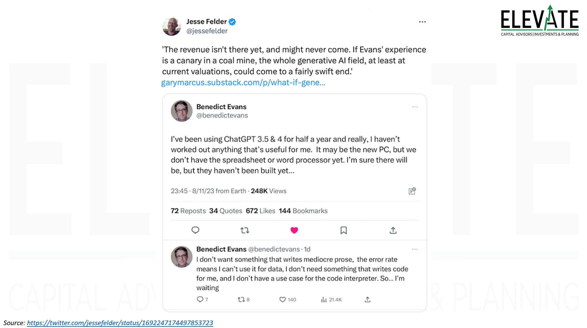
The “AI” Hype Cycle
You may remember back in June when I first wrote about the recent AI craze… well, it looks like I am not alone in not having found much use for Chat GPT over the past few months…
Click Image to Enlarge
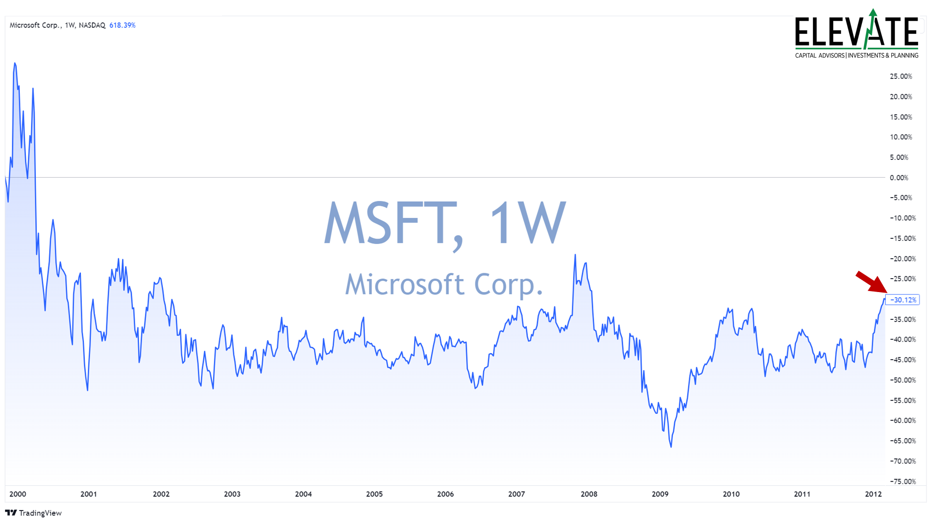
Paying Too Much for Greatness
From 1999 to 2012, Microsoft grew revenue at a compound annual growth rate of 11% a year.
In 1999, Microsoft's EPS was just $0.35.
By 2012, it had an EPS of $3. So, Microsoft became about 8.5 times more profitable in 13 years.
And the company kept fat margins the whole time. From 1999 to 2012, Microsoft's net income margin never dipped lower than 20%.
Leaving out the 1999 year-end spike and measuring from October, Microsoft's share price fell 30% over that 13-year period. Even including dividends, Microsoft investors were down 12%.
The problem was Microsoft's valuation. Even though it was increasingly profitable, its share price was so expensive that it didn't matter.
Microsoft traded at about 27 times sales back in late 1999.Today, Nvidia trades at 37 times sales - 37% higher than MSFT in 1999.
Click Image to Enlarge
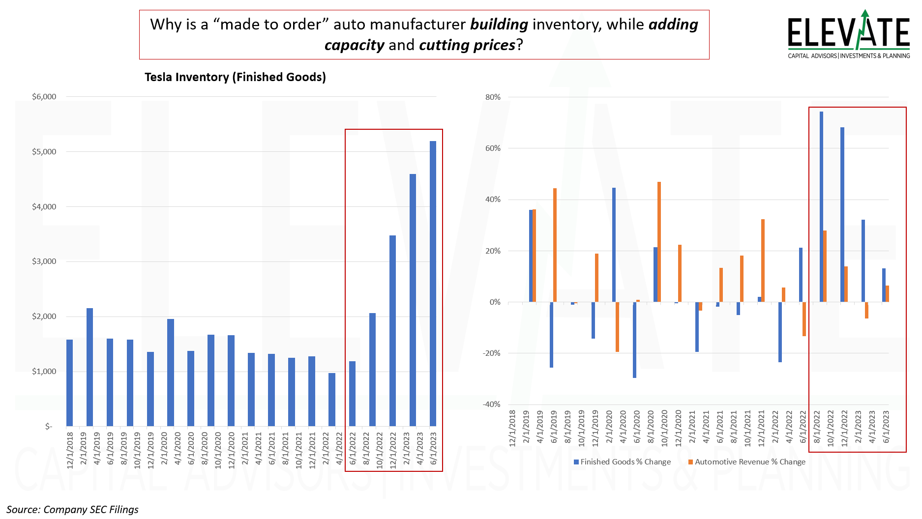
Tesla Inventories
Why is Tesla’s inventory growing so rapidly? I thought they didn’t make the car until a customer ordered it on the website… You’d think that cutting prices as many times as they have the inventory would stop building up.. but nope. If you are in the market for a Tesla you might want to hold off. This data leads me to expect further price cuts coming.
Click Image to Enlarge
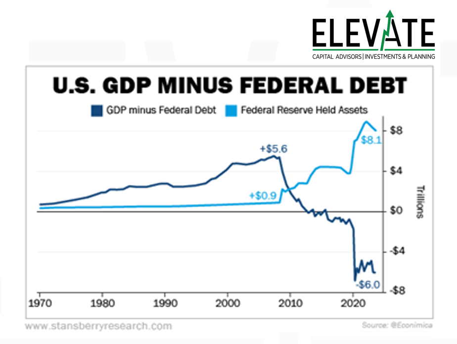
Government Supporting GDP
What would GDP be if the government wasn’t constantly printing money and giving it away? This is one of the most telling charts I have seen an a while. If you subtract the national debt from GDP, it would have been negative since even before COVID. Of course all that debt is behind all the inflation we’ve been experiencing… can they stop printing money without the economy crashing? Will they? If they don’t, will inflation ever go back to 2%?
Click Image to Enlarge
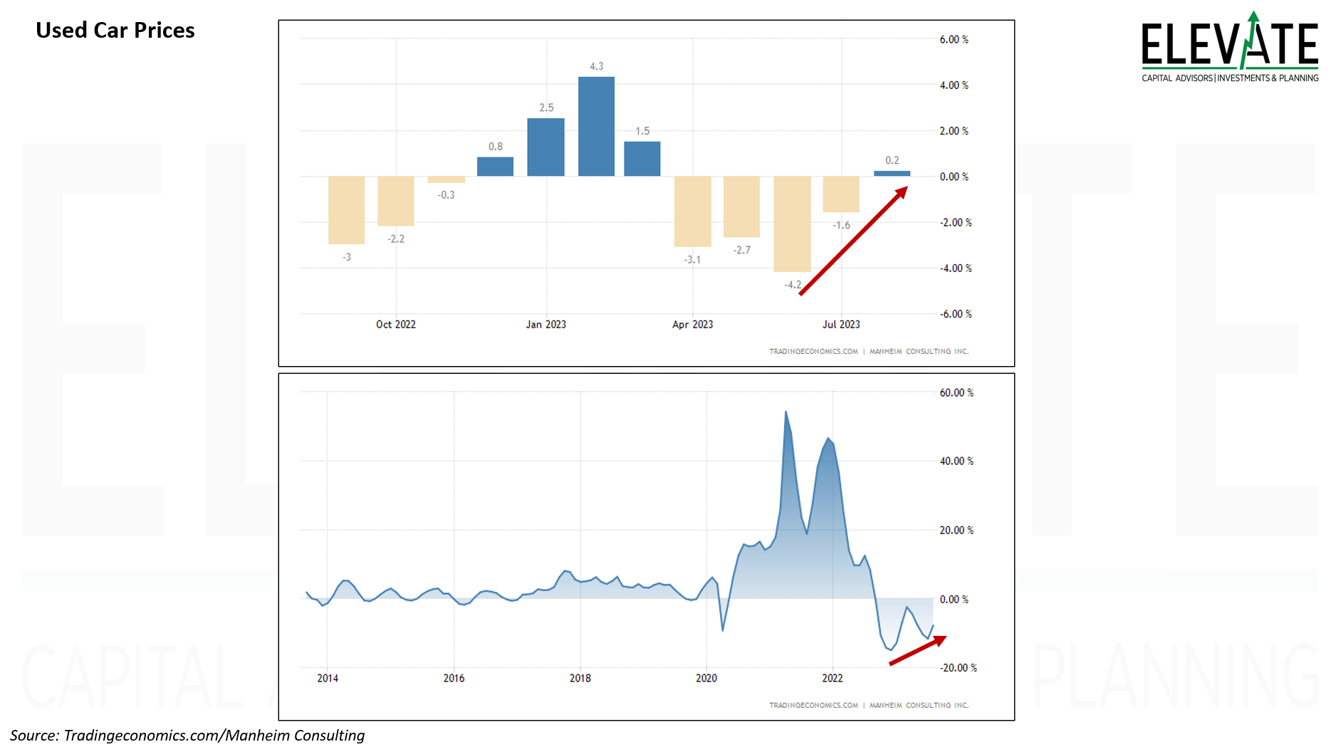
Used Car Prices
Used car prices are ticking higher for the firs time in several months, likely underpinning a rising CPI.
Click Image to Enlarge
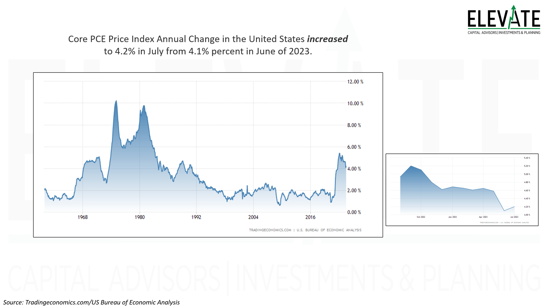
Personal Consumption Expenditures
The data says prices are going up…
Click Image to Enlarge
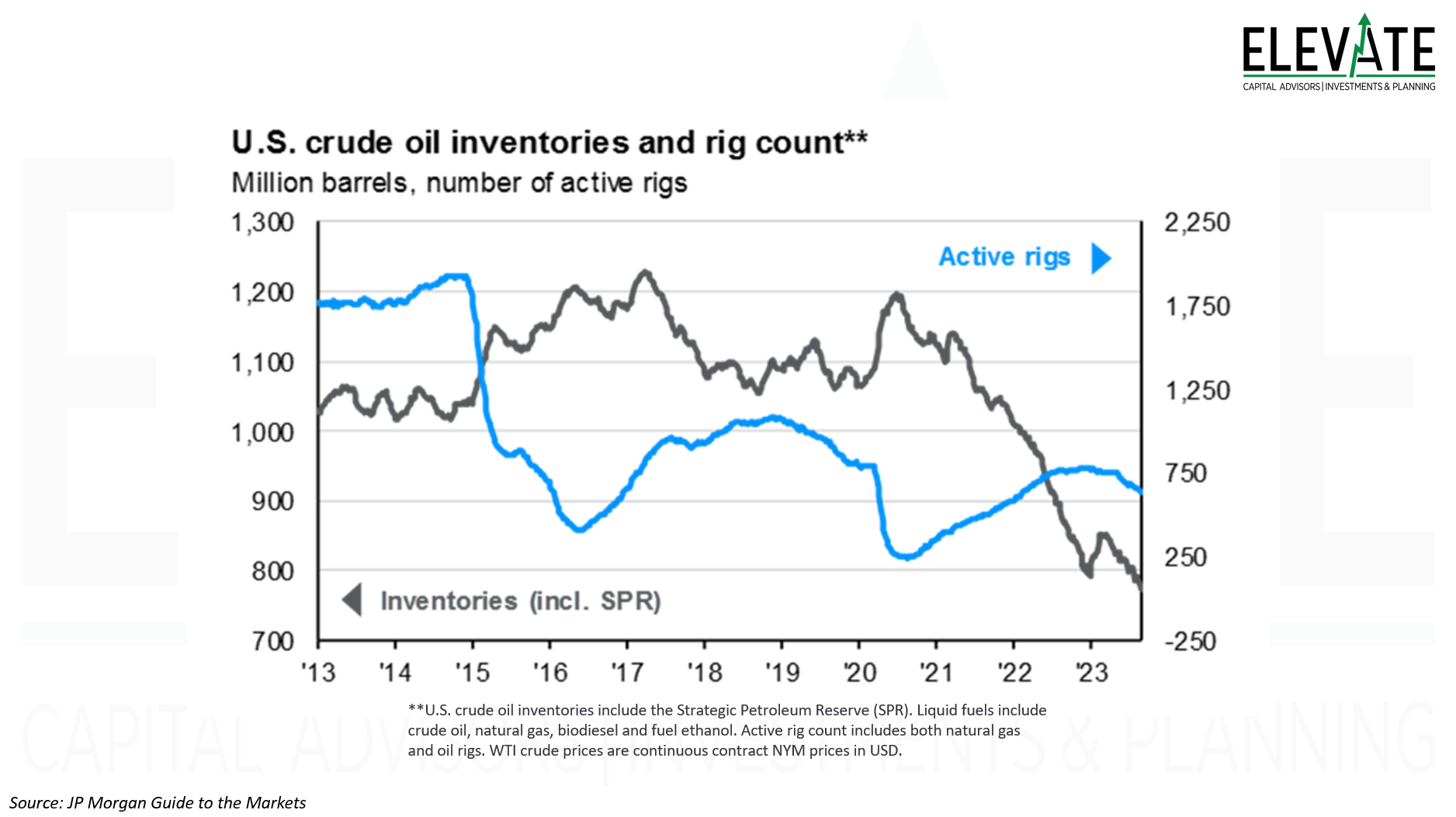
Crude Oil Inventories
Inventories of crude oil dropped to a fresh cycle low. What ever happened to the government refilling the Strategic Petroleum Reserves when oil traded under $70?
Click Image to Enlarge
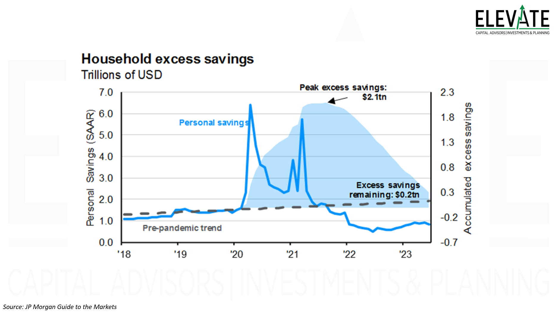
Household Excess Savings
Folks have largely spent their stimulus checks at this point. Credit card debt is at all-time highs, as I have covered in recent commentaries. And now, student loans are accruing interest with payments due in October… What could possibly go wrong?
Click Image to Enlarge
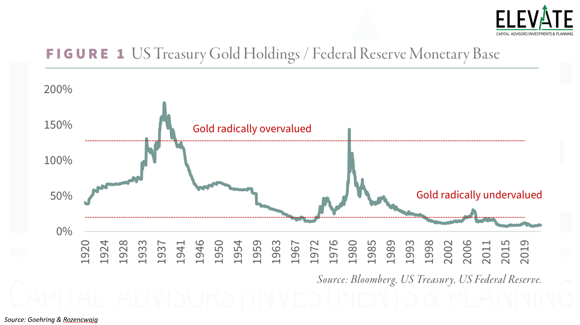
The Value of Gold
I just thought this was interesting… Gold looks pretty cheap. But that has been the case for quite a long time now.
Click Image to Enlarge
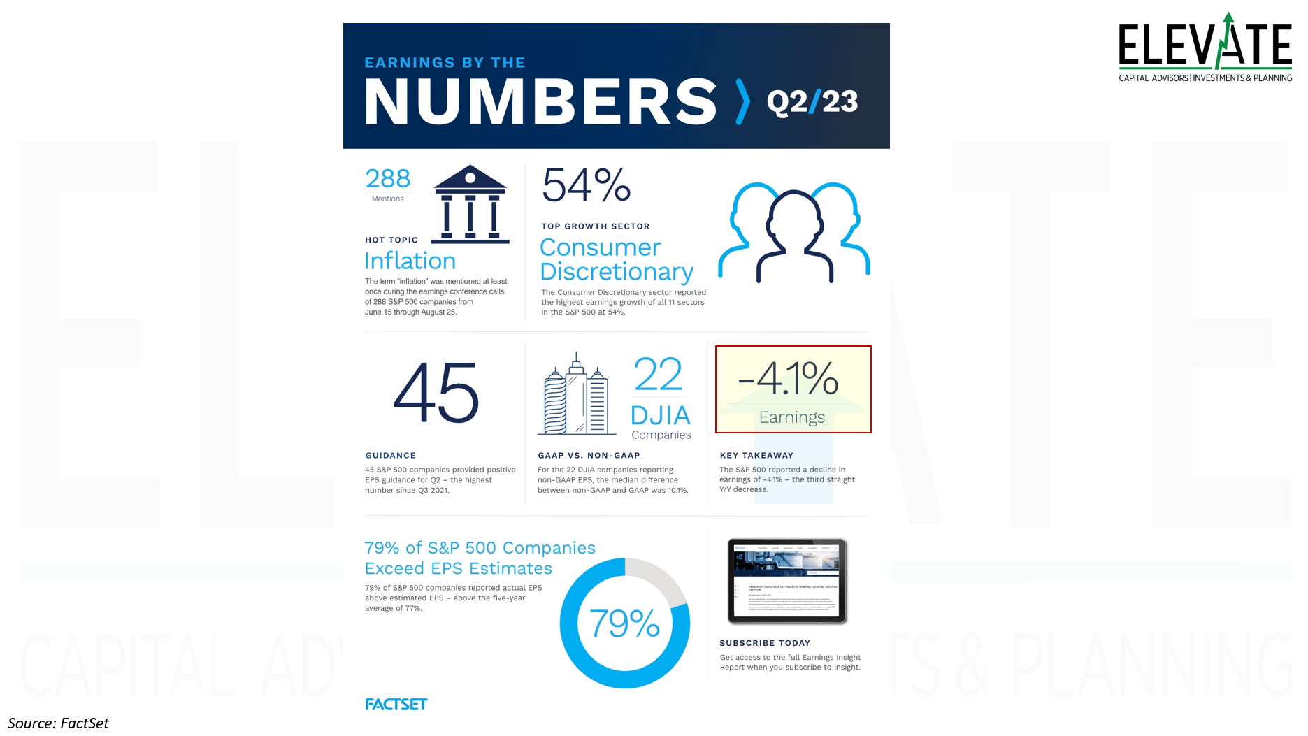
Second Quarter Earnings
My favorite part of this one is that they used an arrow pointing up as the graphic for the -4.1% decline in S&P 500 earnings! This was the third consecutive quarter of declines.
Click Image to Enlarge
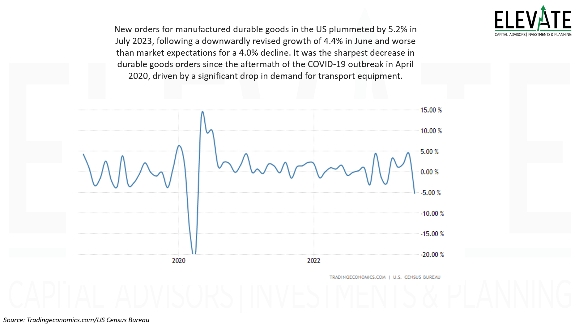
Durable Good Orders
Durable goods orders are an indication of economic health. We just saw a crash to the lowest levels since scared governments panic-closed the entire global economy. The drop was much worse than expectations.
Click Image to Enlarge
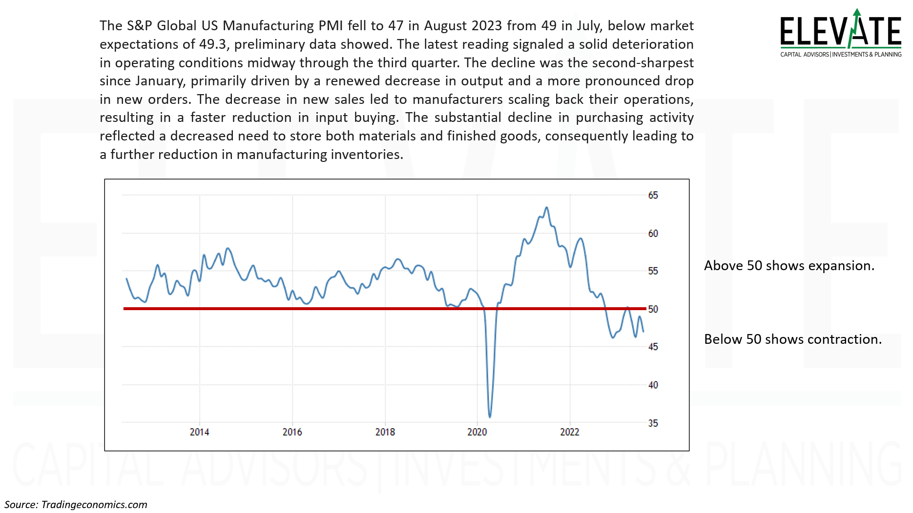
Manufacturing is (still) in Contraction
US Manufacturing slowed more than expected last month and remains in contraction territory.
Click Image to Enlarge
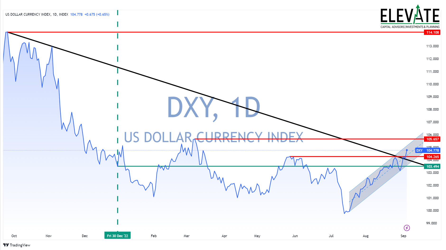
King Dolla!
•now up for the year 2023... (green lines)
•broke the downtrend from recent highs in Sep '22 (black line)
•trading above May highs (lowest red line at 104.265)
•shooting for March highs (red line at 105.657)
As the dollar becomes more valuable it has the effect of driving prices of goods and services (and stocks and bonds) lower, thus reducing price inflation. It also makes earnings generated overseas worth less when converted back to dollars, and reduces demand for American goods and services abroad.
Click Image to Enlarge
OK! I know you’ve had enough so I’ll stop. But trust me - there was more!
Until next time, I thank God for each of you, and I thank each of you for reading this commentary.
Clients, I encourage you to click here to access your personalized performance portal to see how your portfolio performed vs. the markets last month.
Shane Fleury, CFA
Chief Investment Officer
Elevate Capital Advisors
Legal Information and Disclosures
This commentary expresses the views of the author as of the date indicated and such views are subject to change without notice. Elevate Capital Advisors, LLC (“Elevate”) has no duty or obligation to update the information contained herein. This information is being made available for educational purposes only. Certain information contained herein concerning economic trends and performance is based on or derived from information provided by independent third-party sources. Elevate believes that the sources from which such information has been obtained are reliable; however, it cannot guarantee the accuracy of such information and has not independently verified the accuracy or completeness of such information or the assumptions on which such information is based. This memorandum, including the information contained herein, may not be copied, reproduced, republished, or posted in whole or in part, in any form without the prior written consent of Elevate. Further, wherever there exists the potential for profit there is also the risk of loss.