Market Commentary
Wesley Chapel, FL
How many days does it take the moon to orbit the Earth? 27 days.
How many days does it take Mercury to orbit the sun? 88 (Earth) days.
How long is a day on Mercury? 1,408 hours!
How long does it take Pluto (yes, it identifies as a planet, so who are we to say it isn’t one?) to orbit the sun? 90,520 (Earth) days…
How long does the longest known orbit in our universe take?
According to Chat GPT: In our cosmic neighborhood, the Milky Way galaxy, one of the longest known orbits belongs to certain dwarf galaxies that orbit around the Milky Way. For example, the Sagittarius Dwarf Elliptical Galaxy is currently in an orbit around the Milky Way, and its orbital period is estimated to be around 1.6 billion years.
And how long does it take Earth to orbit the sun? 365 days, of course.
So, what is a “year,” really? It seems arbitrary. It just happens to be the number of days it takes one planet (albeit a pretty special planet) to make one trip around just one of 200 billion trillion estimated stars in our universe. Yeah, God is awesome! (Psalm 19:1 – “the heavens declare the glory of God.”)
Does the fact that it takes 365 24-hour days for the Earth to orbit the sun have any meaning or relation whatsoever to the stock market or the sales and profits of a company?

It is popular lately for people to talk about their year-to-date (YTD) performance since stocks are up and bonds are only down slightly. Many have already forgotten how much they were down in 2022 when their 60/40 pie chart prison model lost 16%. They are just happy to report that they are up 11% this year. Never mind that they need 19% just to get back to even.
I think it makes a lot more sense to measure performance “cycle-to-date.” That means from one peak through the ensuing bear market, and to the next peak, regardless of how much time passes between them. It could be months; it could be years. Usually, it is years.
Click to Enlarge | Sector Performance in 2022 vs. 2023 YTD
It isn’t as though everyone’s portfolio resets on January 1st and the prior year results get thrown in the trash can. So why do people care about a YTD performance number? Behavioral psychology, I guess.
Don’t get me wrong, being up YTD is better than being down again. I just think it is still a little too early to be taking victory laps while we are probably still in a bear market.
A common definition of a bull market is one that is up 20% from its lows. But if it were that simple, there would have been at least three different bull markets in the Nasdaq 100 during the 924 days it fell 83% from March of 2000 to its low in September 2002.
It just isn’t that easy. One of those rallies in the Nasdaq was nearly 50% and it lasted over 100 days! It is extremely difficult to stay patient (and bearish) during that sort of rally. But unless you are a short-term trader that was the right move because as soon as that rally was over the market dropped another 51% to a fresh cycle low.
Click to Enlarge | Nasdaq 100 Index 2000-2002
Once the low was finally in for that cycle the market achieved its next peak in October 2007. That cycle, from peak to peak, was about seven and a half years. That is taking a long-term perspective. That is what I am focused on. Ask people what a long-term perspective is these days and many of them will tell you three years, or maybe even less. Almost no one will tell you six months though – which is exactly how long a YTD performance number covers right now.
Click to Enlarge | A list of 45 stocks we analyzed from a fundamental perspective in June.
That isn’t to say I won’t try to take advantage of any continued rally, even if it leads to just short-term profits. I have taken on twelve new positions across the Growth and Value Strategies just in the past month.
If it turns out that we really are in a new bull market, I expect many of these to turn into big and long-term winners. But if things take a turn for the worse (as the economic data seems to indicate) then I expect to get out of several with small gains (in those which are already up nicely) while also taking some small losses.
Given my skepticism and overall bearish perspective I am using tighter than normal stop loss rules on these new positions. Sure, this might cost us some upside if they drop only briefly and then quickly resume their ascent, but if we really are in a new bull market, I expect that we will have plenty of time to buy on dips as the market grinds higher.
I have several charts that I want to share this month but before I do, just a couple quick updates on last month’s commentary where I spent some time on everyone’s favorite investment idea – AI.
First, it seems that the hype may have already peaked for now. Check out the nearby chart of the “Gartner Hype Cycle.” I personally haven’t used ChatGPT or any of its competitors (Google’s Bard or Microsoft’s Bing/Edge) very much at all over the past month. Evidently, I am not alone. According to Reuters:
Click to Enlarge | Gartner Hype Cycle
Worldwide desktop and mobile traffic to the ChatGPT website decreased by 9.7% in June from May, while unique visitors to ChatGPT's website dropped 5.7%. The amount of time visitors spent on the website was also down 8.5%, the data shows.
Of course, it could always be a temporary drop. So, I won’t go so far as to start nailing AI’s coffin shut just yet.
Meanwhile, OpenAI, the creator of ChatGPT is being sued for defamation over its purely fabricated legal accusations against a radio host. I am sure this isn’t the only, nor will it be the last lawsuit in the space.
And if you just want to dig into the technology behind these AI Large Language Models for your own understanding, I encourage you to check out Stephen Wolfram’s post here.
…when ChatGPT does something like write an essay what it's essentially doing is just asking over and over again "given the text so far, what should the next word be?" – and each time adding a word.
The specific engineering of ChatGPT has made it quite compelling. But ultimately (at least until it can use outside tools) ChatGPT is "merely" pulling out some "coherent thread of text" from the "statistics of conventional wisdom" that it's accumulated.
And this post from Honeycomb.io:
The reality is that this tech is hard. LLMs aren’t magic, you won’t solve all the problems in the world using them, and the more you delay releasing your product to everyone, the further behind the curve you’ll be. There are no right answers here. Just a lot of work, users who will blow your mind with ways they break what you built, and a whole host of brand new problems that state-of-the-art machine learning gave you because you decided to use it.
Now, on to the charts!
Click to Enlarge
Click to Enlarge
The two charts above, annual rate of change in Consumer Price Inflation (CPI) and quarterly rate of change in GDP show that both are falling. This leads us to what our friends at Hedgeye refer to as “Quad 4” in their macro framework, which I have no reason to dispute. They have done the homework, and backtested the returns of all types of investments during the four potential environments and the numbers speak for themselves. Of course, no two economic environments are identical and there is always some nuance to consider, the research tells me where to look for potential investments and perhaps more importantly where not to look.
See the Hedgeye Quads below.
Click to Enlarge
One other thing to note here as it relates to CPI. If you look closely at the CPI chart above, you’ll notice that June was the highest inflation at 9.1%. Since this chart is only looking back one year, you cant see that June was the peak so far for this cycle, but it was! That means one year later, all else equal, you would see the largest annual drop in CPI. So, starting next month when July CPI is reported it the 1 year rate of change will be measured from July of last year. It will be more difficult to drop as far because it is measured from a lower starting point. This will continue for the next year at least. We call this “harder comps” or harder comparables, going forward. So, it is likely the seemingly rapid disinflation that we’ve seen over the past few months will begin to slow through the rest of 2023. And we are still not at the FED’s 2% target.
Lets move on to the Money Supply.
Click to Enlarge
In this chart (above) you can see that the supply of money in circulation is still in decline as it has been all year although the rate of decline as moderated somewhat from the lows (-5%) seen in April. But this is still an unprecedented situation with very negative implications. Less money in circulation is good for bringing down inflation. The recent and also unprecedented spike to over 25% is what got us into the inflation situation we are in where prices of everything from lawnmowers to stocks rocketed higher.
I don’t think we’ll see such a large magnitude drop in M2 because the FED does not want to cause outright “deflation” where prices of goods and services actually fall. What they want is “disinflation,” which means prices still rise overall, but at a slower rate. This would still be a negative for company profitability and therefore stock prices.
The truth is that nobody knows how this will play out, myself included. But the implications are dire.
Up next, the yield curve.
Click to Enlarge
Click to Enlarge
Click to Enlarge
The three charts above show the spread between the 10-year US Treasury Yield and shorter-term treasuries. In a normal and healthy economy, longer-term rates should be higher than shorter-term rates, for the same lender, especially when that lender is your Uncle Sam and can print as many dollars as he wants to pay you back. But as I have noted in this commentary for more than a year, that is not the case in our economy and hasn’t been for a while. That is because our economy is decidedly unhealthy.
The spread on the 10’s minus 2’s is the most negative it has been for this cycle and lower than at any time in the past 40 years. The 10’s minus 3-months is at its lowest point in history, also going back more than 40 years.
Click to Enlarge
The Manufacturing ISM Report On Business is based on data compiled from purchasing and supply executives nationwide. Survey responses reflect the change, if any, in the current month compared to the previous month.
I think the slide above generally speaks for itself, so I don’t have anything to add.
Our friends at Sentimentrader do though…
Click to Enlarge
Again, the slide above speaks for itself. I would add that per Sentimentrader’s research, this divergence does not necessarily suggest that stocks will crash from here. But definitely something to keep an eye on because it really doesn’t make much sense.
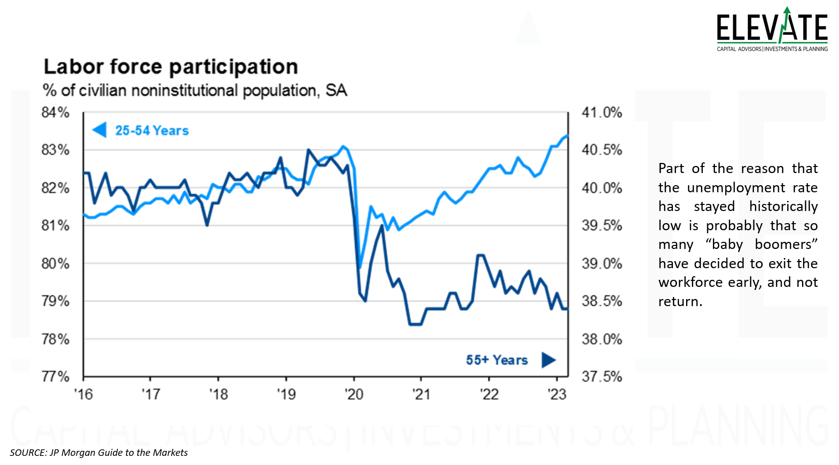
Now, let’s jump into some slides from JP Morgan’s Guide to the Markets. I will comment on some while others are pretty self explanatory, and/or I have already written comments in the slide. I reviewed nearly 150 slides of economic data and collected 13 which I thought were interesting or insightful enough to share with you. I think it is a good idea to open each of them and just take a quick look. As they say, a picture is worth a thousand words.
Click to Enlarge
Click to Enlarge
Click to Enlarge
Click to Enlarge
One place it makes some sense to me to be looking for and taking longs is in home building. We don’t currently have any direct exposure to home builders, but we do have some indirect exposure. Many people who own their home already have a much lower interest rate than they’ll have to pay if they sell and move to a new home. So, that is restricting the existing supply and keeping demand high for new builds. There is a limit to how high mortgage rates can go before that slows everything down, but so far, so good. People need somewhere to live and the USA is under-supplied with homes.
Click to Enlarge
There is a lot going on with this slide above, but the part I want to highlight is boxed in red with an arrow leading to the forecasted interest expense.
The government plans to just keep on borrowing, and they will. Which is why we just raised the debt ceiling yet again.
What is interesting to me about this slide is that the top right chart shows the forecasted interest expense growing every year but that is based on a 10-yeaer US Treasury Yield of only 3.8% in perpetuity… well, the 10-year yield today is already 4.06% and rising.
According to a recent article by CNN (not my favorite source):
The Treasury Department paid a record $213 billion in interest payments on the national debt in the last quarter of 2022, up $63 billion from the same period a year earlier.
The fourth-quarter tab was also nearly $30 billion more than in the prior quarter, which is the largest quarterly increase on record, said Jerry Dwyer, an economics professor emeritus at Clemson University.
By 2032, interest costs will triple to more than $3 billion per day and to at least $9,400 per household, on average, according to the foundation. They are on track to become the largest federal budget item, surpassing Social Security and Medicare by the middle of the century.
What could possibly go wrong?
Click to Enlarge
Here we see that credit card and auto delinquencies have been steadily ticking higher. The only reason student loans haven’t been doing the same is because most haven’t needed to make payments for years. That recently changed with the Supreme Court’s ruling that President Biden does not have the authority to forgive $430 billion of student debt. The president will find ways to stall full repayments from beginning in August, but many will need to begin repaying in the near future. More on that in my wrap up below - keep on reading!
Click to Enlarge
Click to Enlarge
Click to Enlarge
The market is currently (and has been) expecting rates to come down faster than the FED expects. The market has been wrong so far.
But make no mistake, when the FED finally does cut rates, it will probably be because we are in the throes of a recession with the market melting down. If history is any guide, the market won’t bottom until after the FED starts cutting rates, as was discussed in my November 2022 commentary.
Click to Enlarge
Inflation around the world is still quite high.
Click to Enlarge
If you are in looking to buy some real estate to create some reliable income, now is probably not the time to buy. In fact, this is the worst time since 2008 to make that investment with cap rates barely exceeding the 10-year US Treasury Yield. It might make more sense to buy a treasury ladder until cap rates go back up.
For those of you who don’t know, you can think of the “cap rate” just like the interest on a bond.
Also interesting on the right hand chart is that I would have expected office vacancies to be even higher.
Click to Enlarge
Click to Enlarge
If history is any guide, don’t be surprised if hitting the next all-time high in the S&P 500 takes a few years… in fact, we should be more surprised if it doesn’t take a few years.
That’s it for the guide to the markets. Let’s wrap this up.
Click to Enlarge | S&P 500 ETF (SPY) Chart
In the above chart of the SPY exchange traded fund, we see that the market has clearly been in an uptrend since hitting a cycle-to-date low in October. The green arrow on the right shows that the 200-day moving average is also once again trending higher, up for the past 20 consecutive trading days after stalling out for a couple weeks at the end of May.
We can also see that the market is still trading below its all-time high.
In the indicator chart below the price chart, we can see that momentum is currently declining and in the very bottom indicator, we can see that the RSI recently signaled extremely overbought. See the red circle. The last time the index was that overbought, back in August 2022, it preceded a drop of about 17% to a fresh low in about 6 weeks. As the saying goes, history doesn’t always repeat, but it often rhymes.
On Wednesday, we will get inflation data for the month of June. The market is expecting a drop from 4% in May to 3.1%. But the FED tends to pay more attention to “Core” inflation which excludes volatile food and energy prices. Core inflation is expected at 5.0% in June, down from 5.3% in May. No matter how you slice it – none of these numbers are 2% (the FED’s stated target) and I expect the FED to resume hiking rates when they meet again on July 26th.
As I have said in this commentary before, inflation is yesterday’s news. The market will violently react to the numbers when they are released, but I expect that to be short-term in nature.
The more important economic data continues to roll in daily and weekly and from my perspective, it just keeps getting worse. As credit standards tighten and loan delinquency rates rise, folks will have to start repaying their student loans for the first time since world leaders panicked and shut down the global economy. From an article at The Guardian:
“There’s no way I can pay it. They’ve got it set up so you can never pay it off,” said Chaney, who still owes around $60,000 in student loans. “I keep making $400 or $500 a month payments and none of the principal goes down. I worked all my life and I don’t have nothing. I’ve worked six days a week, 12-hour days in the steel mill before I got hurt. We’re barely staying alive. I can’t keep up. I can’t pay it.”
“Adding another expense to my budget would put me beyond a financial hardship,” said Anne Marie Mosley, a teacher in Massachusetts who is still waiting to see if her public loan service forgiveness application is approved.
“When payments restart, I will not pay. I’m an underpaid teacher and I just won’t have the funds,” said Jacque Abron of Texas.
“I went from paying about $1,000 a month to now over $2,000 in groceries, I cannot even imagine paying another large bill like this,” said Gallardo. “I don’t even know how we would make it work with resuming payments based on how much everything has gone up in my state. I have not been paying during the pause because all our money either goes to bills or taxes, we haven’t even been able to afford health insurance right now.”
Clients, I encourage you to click here to access your personalized performance portal to see how your portfolio performed vs. the markets last month.
Until next time, I thank God for each of you, and I thank each of you for reading this commentary.
Shane Fleury, CFA
Chief Investment Officer
Elevate Capital Advisors
Legal Information and Disclosures
This commentary expresses the views of the author as of the date indicated and such views are subject to change without notice. Elevate Capital Advisors, LLC (“Elevate”) has no duty or obligation to update the information contained herein. This information is being made available for educational purposes only. Certain information contained herein concerning economic trends and performance is based on or derived from information provided by independent third-party sources. Elevate believes that the sources from which such information has been obtained are reliable; however, it cannot guarantee the accuracy of such information and has not independently verified the accuracy or completeness of such information or the assumptions on which such information is based. This memorandum, including the information contained herein, may not be copied, reproduced, republished, or posted in whole or in part, in any form without the prior written consent of Elevate. Further, wherever there exists the potential for profit there is also the risk of loss.